Website Modernization for Traditional SMEs: From Digital Showcase to Trust-and-Fit Filter
Many traditional SME websites look acceptable yet still lose inquiries. Here are the three levers that turn a static site into a trust-and-fit filter.
Contents
Many traditional SME websites look acceptable yet still lose inquiries. Here are the three levers that turn a static site into a trust-and-fit filter.
Share this article
The call that no longer comes
The managing director of a 32-employee metalworking and locksmith business in Upper Austria sits in his office on a Tuesday morning. The phone rings less often than it used to. Referrals from the network still arrive, but the inquiries seem less prepared. Some prospects ask questions that should already be clear on the website. Others simply never get in touch after visiting the site.
The person who handles inquiries in the office confirms the impression: "People still call, but often they don't know what we actually do. They saw the website and still have no idea whether we can take on their project."
The problem is not that the website looks bad. It was designed four years ago by an agency, the colors match the brand, the project photos are decent. The problem is that it was built for a different buyer: someone who already knew the company and was just looking for a phone number. Today's buyer researches online first, compares in seconds, and decides whether a call is worthwhile before even picking up the phone.
The OECD describes SME digitalisation as a competitiveness issue, not a marketing luxury. If a business does not appear clear, current, and trustworthy online, it drops out during the research phase — even if its product or service is excellent.
Why the old website answers the wrong questions
From showcase to filter
The classic SME website is a digital showcase: homepage, services overview, references, contact. It was designed to represent the company. That was enough as long as the visitor arrived through word-of-mouth and only needed confirmation.
Today, most first contacts happen differently. According to BrightLocal, 80 percent of US consumers search online for local businesses weekly, 32 percent even daily. Nearly half add "near me" or local terms to their searches. The visitor landing on the website asks different questions than ten years ago: Do they do what I need? Are they active in my region? Are they credible? How do I get an answer quickly?
A static website only answers these questions if the visitor finds the right page. It does not filter. It does not qualify. It hopes the prospect is patient enough to navigate through menus and subpages until they understand whether the offer fits.
What buyers check first today
The modern buyer scans a website in a few seconds. They look for signals that answer three things:
- Fit: Is this company specialised for my specific problem or region?
- Trust: Are there real signs of experience, transparency, and accessibility?
- Next step: Can I take the right action without friction — call, book, or request a quote?
If one of these answers is missing or hidden, the tab closes. BrightLocal found that 62 percent of consumers would avoid a business if they found incorrect or incomplete information online. This is not a design question. It is an information architecture question.
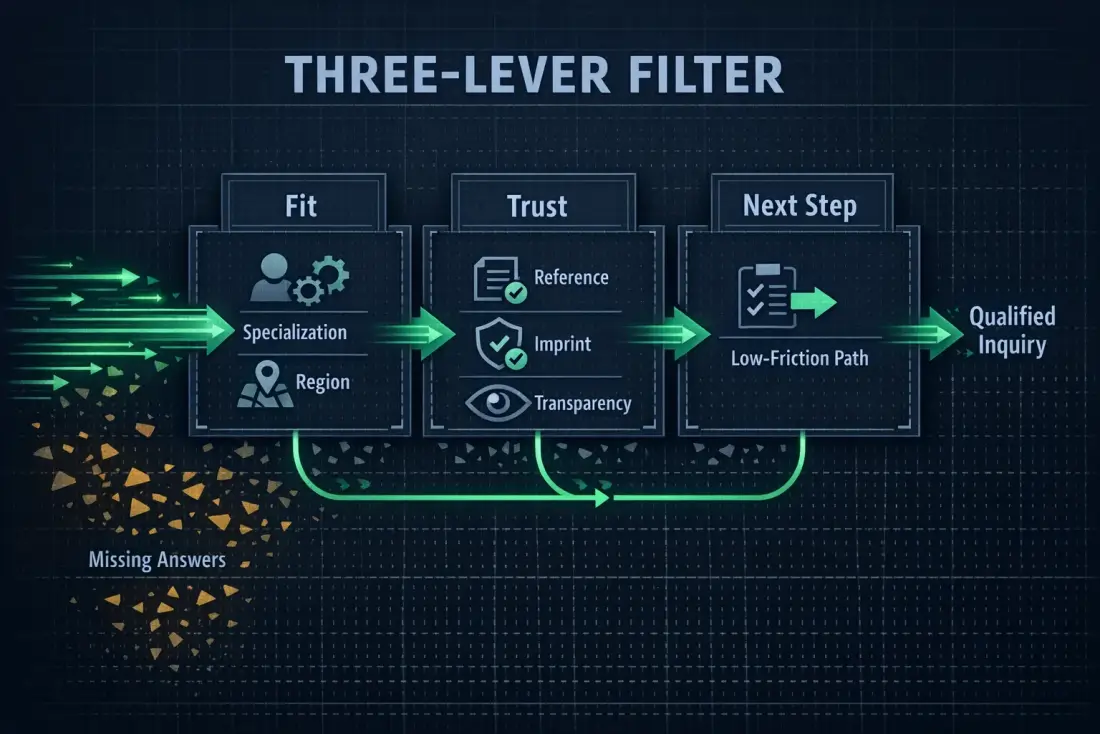
Three-lever model: fit, trust, and next step as a filter for the buyer journey.
The hidden cost of a static website
Wasted referrals
Referrals are considered the most valuable marketing for traditional businesses. But the referral circle now researches online first. When Maria recommends the metalworking company to a colleague, that colleague will open the website before calling. If they find no clear specialisation, no current references, and no visible region, the call may go to a competitor whose website explains the fit in 30 seconds.
The damage is hard to see because it does not appear as a lost call. It does not appear at all. The company still sees traffic, but the conversion rate stays low without a concrete reason being named.
Mobile leaks
Many traditional websites are evaluated in the office on a large monitor. There they look acceptable. But the relevant traffic is increasingly mobile. BrightLocal shows that local searches are strongly mobile-driven, and consumers expect to reach core information quickly on their smartphones.
A mobile site where the phone number is buried, the menu is unusable, or the contact form aborts before submission loses prospects who already intended to make contact. Google measures this experience through Core Web Vitals: LCP should occur within 2.5 seconds, INP under 200 milliseconds, CLS at 0.1 or less. These thresholds are measured at the 75th percentile of real page loads, segmented by mobile and desktop. A website that misses them not only offers a worse user experience — it also signals that the company does not take the digital first contact seriously.
Trust deficit before first contact
In B2B especially, procurement contacts and decision-makers check whether the website feels trustworthy before they call. A current imprint, a visible privacy policy, clear contact details, and a professional impression are no longer legal formalities but signals that determine the first contact.
The European Commission's Digital Services Act creates a single set of rules for online services in the EU. The European Accessibility Act extends requirements to digital products and services, including e-commerce. For a traditional SME, this means a website that ignores transparency and accessibility not only looks dated but risks being classified as operationally immature by professional buyers. This is not legal advice; it is an observation about trust as a competitive factor.
The three levers that actually matter
If modernization is not conceived as a large, expensive redesign but as a targeted improvement of the buyer journey, it reduces to three levers. Each lever answers one of the questions the visitor asks within the first seconds.
Lever 1: Fit at first glance
The first lever is clear positioning. Within the first view of the homepage, it must be clear who the company serves, which services are in focus, and in which region or industry it operates. Not all services equally, but the two or three that carry most of the demand.
For the metalworking company in this example, that might mean: metal façades, locksmith work, and custom constructions for commercial and industrial clients in Upper Austria. Not hidden in a subpage, but visible as the first information. The visitor searching for a metalworker for a warehouse gate immediately recognises: this is someone who does that.
Lever 2: Verifiable trust signals
The second lever is trust signals that are not hollow phrases. These can be current reference projects with real details, a transparent team photo, a current imprint, clear contact details with opening hours, or indications of certifications and industry memberships. The important thing is that these signals can be verified. "Over 20 years of experience" without context quickly feels empty.
The technical quality of the website is also a trust signal. If the site loads slowly, breaks on mobile devices, or shows outdated certificates, it undermines the impression of professionalism. Google emphasises in its core updates documentation that websites should offer helpful, reliable, people-first content. That applies not only to content but also to technical implementation.
Lever 3: The next step without friction
The third lever is the low-friction next step. Not every visitor wants to call immediately. Some want to book an appointment, others want to request a short quote, others only want to check whether the company is suitable for their project. The website must offer an appropriate action for each intent level.
Concretely, that means: the phone number is clickable on mobile devices. The contact form has only as many fields as necessary. A booking link is visible for the recommended visitor. Those not yet ready find a way to leave their email for a short fit check. Every additional friction point reduces the likelihood that the prospect will make contact.
From relaunch to operating model
Technical health before design trends
Many modernizations start with a desire for a fresher design. That is understandable, but often the wrong starting point. A new colour scheme does not change the fact that the site is slow, the content is outdated, or the form does not work. The first step should therefore be a technical health check.
Core Web Vitals provide a tangible framework for this. LCP measures how quickly the main content becomes visible. INP measures responsiveness to interactions. CLS measures how visually stable the page remains. These values are measured at the 75th percentile of real page loads, separated by mobile and desktop. Anyone who monitors these values regularly has an objective basis for improvements instead of modernising by gut feeling.
Mobile first, not desktop last
A website that looks good on desktop and only half works on smartphone is insufficient for local and mobile traffic. Mobile first does not just mean the layout scales. It means the most important information and actions are immediately accessible on small screens.
Concretely, the phone number and the booking or inquiry button should be reachable without scrolling or opening a menu. Forms must work with the mobile keyboard. Images and scripts should not overly burden mobile data usage. Whoever neglects this focus builds a website for a usage pattern that no longer matches how buyers research today.
Content ownership and maintainability
A modern website is not a one-off project that remains unchanged for years after launch. It is an operating asset that needs care. That means the company should be able to update content itself without having to hire an agency for every small change. At the same time, it should remain the owner of the code and content so that changing service providers or future extensions remain possible.
This ownership and maintainability question is often underestimated. A website running on a proprietary platform where the company has neither access to the source code nor the database becomes technical debt over time. By contrast, open standards, clear deployment processes, and documented infrastructure keep the company in control of its digital showcase.
A realistic SME case
Before: home, services, contact
The metalworking company is an illustrative example. It has 32 employees, four to six recurring service areas, and around 1,200 monthly website visits, a high share of them from mobile devices. Monthly contact form inquiries number eight to twelve. Average first-response time before modernization was one to two business days. These figures are not presented as Planfold customer data but as a realistic scenario typical for a traditional SME of this size.
The old homepage showed a large photo of the workshop hall, the headline "Quality from Tradition," and a general service catalogue underneath. Anyone searching for something specific had to open several subpages. The phone number was in the footer. The contact form had seven mandatory fields and did not work reliably on some mobile devices.
The decision points for the team were clear: Which three services should be immediately visible on the homepage? Which trust signals are missing or outdated? Which next step matches which visitor intent? Which content can the team maintain themselves? And which mobile barriers block the most visitors?
After: fit, trust, next step
After targeted modernization, the homepage looks different. At the top is not a general vision but a clear positioning: "Metal façades, locksmith work, and custom constructions for commercial and industrial clients in Upper Austria." Below that are the three main services, each with a concrete project example and a link to the detail page.
Trust signals are visible: a current reference project with location and year, a short statement from the managing director, opening hours, a clearly visible imprint and privacy menu, and a note about the trade licence. On mobile devices, the phone number appears as a clickable link at the top right. The contact form has been reduced to four fields. Those who prefer to book an appointment find a direct booking link.
Human approvals remain in place: the managing director and the office manager review all fit and trust claims before publication. The external marketing support documents changes in a content calendar. The workshop manager confirms technical capacity claims. Every week they briefly discuss: Which inquiries came through which page? What was the response time? What information was missing?
Viewed illustratively, after 90 days the team knows which pages mobile visitors leave, which inquiries are better qualified, and which content needs regular maintenance. The website has not only been renewed but made operationally usable.
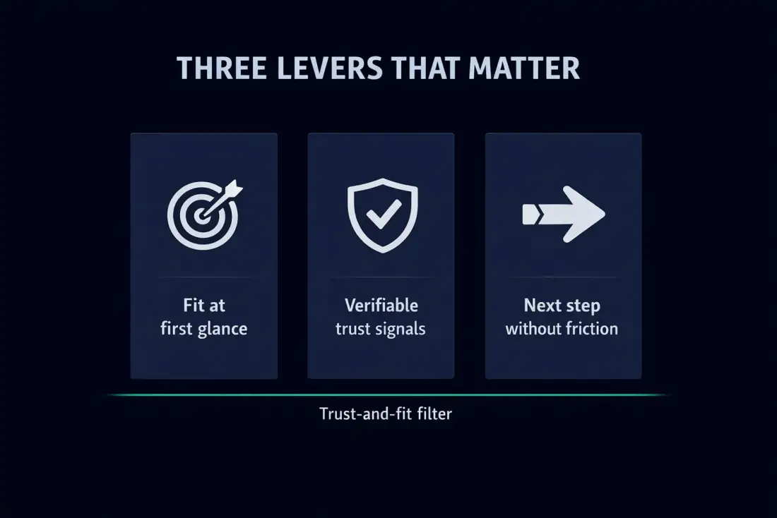
Three levers turn a traditional SME website into a trust-and-fit filter.
How Planfold turns this into a Digital Headquarters
Plan: audit the site against the buyer journey
Planfold does not approach website modernization as a design project but as architecture for the buyer journey. The first step is an audit that measures the current website against the actual questions visitors ask: Where is the fit unclear? Which trust signals are missing? At which points does the next step break?
This audit is not an aesthetic review. It assesses information architecture, mobile usability, technical performance against Core Web Vitals, the quality of conversion paths, and compliance signals such as imprint, privacy, and accessibility. The result is not a wish list but a prioritised sequence of the levers that will deliver the fastest measurable effect.
Unfold: build the three levers
In the second step, the three levers are implemented on a technically sound foundation. The positioning is formulated fit-first, trust signals are updated and made verifiable, and conversion paths are opened for different visitor intents.
Planfold does this through the Digital Headquarters: a website that is more than a digital business card. It is built as a high-performance platform with load times under two seconds, SEO fundamentals, GDPR-compliant implementation, and DACH hosting options. The source code remains owned by the company, the content is maintainable, and the technical base is designed to evolve.
Resonate: measure, maintain, improve
A website that is not maintained after launch quickly becomes static again. That is why the Digital Headquarters includes an operating model: regular updates, technical monitoring, performance measurement, and a content rhythm that prevents references and details from going stale.
Planfold takes over ongoing operations if the company wishes. That does not mean the SME loses control. On the contrary: the company retains ownership and decision-making authority while Planfold ensures stability, speed, and technical currency. It is important to note that Planfold does not guarantee rankings, lead volume, conversion lift, or ROI. The supportable effect is operational: a clear, fast, trustworthy website that supports the buyer journey.
The 90-day start plan: from static site to trust filter
A complete modernization does not have to happen in one big bang. For a traditional SME with limited internal resources, a sequenced 90-day plan is more realistic and effective.
Weeks 1-2: audit fit and trust
In the first two weeks, the focus is on analysis. The team runs the 30-second fit test, gathers the most important trust signals, and checks which content is current. In parallel, technical performance is measured: load times, mobile usability, form function, certificates, and Core Web Vitals. The result is a prioritised list of the biggest gaps.
Weeks 3-6: content, structure, and mobile use
In the second phase, content is restructured. The homepage receives a fit-first positioning. The most important services are highlighted clearly. Trust signals are added. The mobile experience is improved: phone number visible, menu usable, forms shortened. Where possible, first conversion paths are created for different visitor intents.
Weeks 7-12: technical foundation and conversion paths
In the final phase, the technical foundation is stabilised. This can include optimising load times, cleaning up outdated plugins or scripts, introducing a clear deployment process, and setting up a monitoring rhythm. Conversion paths are tested and documented. The team establishes a content calendar to ensure regular updates.
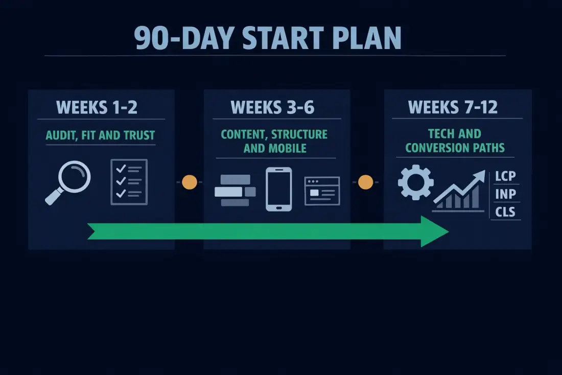
90-day start plan: audit, content/structure/mobile, technical foundation and conversion paths.