AI Search Landing Page Architecture for SMEs: Turning Fewer Clicks into Better Qualified Leads
AI answers and zero-click search change what B2B buyers already believe before they reach your website. This article shows how SMEs can design landing pages as decision architecture: clear promise, proof near the CTA, service-fit routing, consent-aware forms, and measurable follow-up.
Contents
AI answers and zero-click search change what B2B buyers already believe before they reach your website. This article shows how SMEs can design landing pages as decision architecture: clear promise, proof near the CTA, service-fit routing, consent-aware forms, and measurable follow-up.
Share this article
The click that already has an opinion
On Monday morning, Marie opens the analytics dashboard for a DACH-wide technical service provider. The company has 42 employees, serves industrial customers across the DACH region, and sells maintenance, spare parts, and modernization projects. The modernization landing page has fewer organic sessions than it had last year. At the same time, sales calls are more specific: "Do you work with existing equipment?", "Have you handled urgent downtime risk?", "What does the first diagnostic step look like?"
Lukas, the sales lead, reads the situation differently from Marie. The lower session count matters, but it is not the whole issue. Prospects are arriving with a pre-formed view. Some have read an AI summary, some have seen a comparison page, and some come through a referral but still need to check whether der DACH-weit agierende technische Dienstleister is credible for their case. The landing page still explains the company in broad terms. It does not answer the sharper question now in the room: "Is this provider credible for my specific situation?"
The numbers in this scenario are illustrative: 2,400 monthly website sessions, eight high-intent landing pages, three main buyer intents, 45 to 60 CTA interactions, 18 to 25 form starts, and 10 to 14 conversations that seem genuinely qualified. The exact number is not the point. The pattern is: more traffic does not solve much if the page does not make the next decision easier.
In the AI-search era, a landing page is less a brochure and more a decision architecture. It must confirm what the buyer already thinks they know, reduce uncertainty, place proof where the next step happens, clarify service fit, and ask only for the data needed for the first useful follow-up.
Why AI search changes the landing-page question
AI search does not mean buyers stop clicking. The stronger and safer claim is that answer surfaces can move part of the information search before the click. A current measurement of Google AI Overviews issued 55,393 trending queries and found AI Overview activation of 13.7 percent overall and 64.7 percent for question-form queries. The paper also reports that almost 30 percent of cited domains did not appear in the co-displayed first-page organic results (arXiv 2605.14021).
A second study compared Google Search, Gemini, and AI Overviews across 11,500 user queries. It found substantial differences in which sources the systems retrieved and how stable those source choices were across similar queries (arXiv 2604.27790). For SMEs, this is neither a guarantee nor a panic formula. It changes the operating question: the visitor may not arrive through a clean keyword-to-page journey. They may have already seen a summary, a competitor mention, or a source that compressed your positioning.
That makes classic landing-page optimization too narrow. A better headline or brighter button is not enough when the buyer brings doubts from a previous answer surface. The page has to show faster who the offer fits, which evidence supports the claim, and which next step carries low risk.
Visibility remains the foundation. Technical SEO, structured content, performance, and clear entities still help search systems and buyers understand the business. But this landing-page question begins after visibility: what happens when a visitor arrives with compressed context and has to decide whether they trust you enough to take the next step?
The cost of a brochure landing page
A brochure landing page explains who you are. A decision landing page explains why the visitor can trust the next step now. The difference is visible not only in conversion rate. It shows up in conversation quality, repeated sales questions, missing context, and uncertainty about whether the website persuaded the right people.
The first cost is scattered proof. Many SMEs have good evidence: project examples, references, certifications, technical standards, and operating experience. But the evidence lives on separate subpages or in slide decks. Next to the CTA, there is often only a generic claim. The buyer is asked to share data before the page has shown why that step is reasonable.
The second cost is unclear service fit. A page that offers everything forces the visitor to diagnose themselves. Do they need a callback, a technical assessment, a workshop, a price indication, or just a clarified question? If every intent lands on one button, the visitor has to infer the internal process behind the form. That is not their job.
The third cost is distrust at the form. An empirical study of the lead-marketing ecosystem instrumented more than 100 health-related lead-generation websites and observed sensitive information being shared with more than 70 third parties, followed by thousands of downstream contact attempts (arXiv 2604.06759). This does not prove that every B2B contact form brokers data. It is a useful warning: forms need to explain why specific data is needed now and where the request goes operationally.
The older conversion-engine argument is still useful, but this article works in a narrower space. It is not about broad return math or the website as a general sales machine. It is about the architecture of one high-intent page that earns the next decision after AI search, comparison, or referral exposure.
The architecture of the next decision
A strong landing page does not walk the visitor through every possible detail. It walks them through the next decision. That requires a deliberate sequence: promise, fit, proof, next step, data minimization, and follow-up boundary.
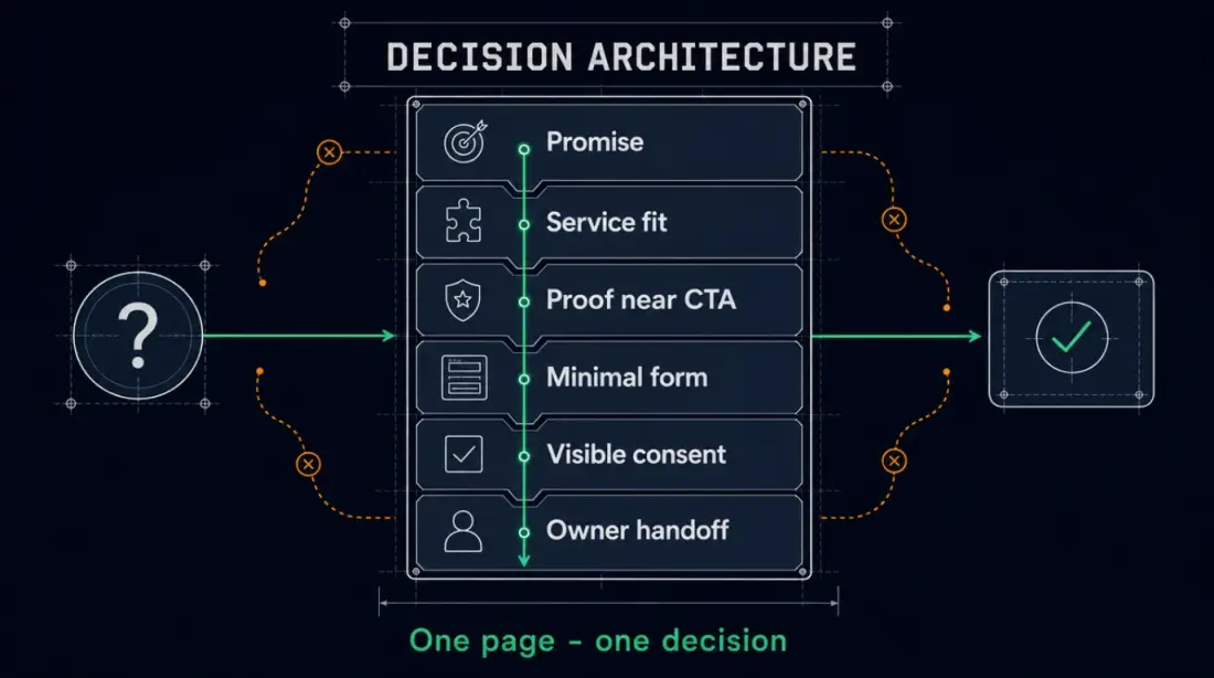
| Building block | Operating question | Strong implementation |
|---|---|---|
| Promise | Which concrete problem is solved for whom? | A headline that connects target customer, situation, and outcome. |
| Service fit | Am I in the right place? | Two or three clearly described next steps instead of one generic CTA. |
| Proof | Why should I believe this? | A short, relevant evidence block close to the CTA. |
| Form | Which data is needed now? | Only the fields required for the first useful step. |
| Consent | What happens to my request? | Visible explanation of purpose, response path, and data boundary. |
| Handoff | Who owns the next step? | A visible owner or process before commercial commitments are made. |
The promise above the fold should not say only "We digitize your company." For der DACH-weit agierende technische Dienstleister it could say: "Modernize existing industrial equipment without unplanned production downtime." That is narrower, easier to evaluate, and more helpful. It gives the visitor an immediate hypothesis: this page fits my situation, or it does not.
Proof belongs where the decision happens. A full case study can remain valuable, but a short proof block near the CTA does a different job: it reduces decision work. A technical statement, a relevant data point from a real project, a link to a suitable proof page, or a clear methodology note can be stronger than three distant testimonials.
For the form, data minimization is not just UX. It is part of trust. Nielsen Norman Group recommends short, logically grouped forms with visible labels and specific error messages (NN/g Website Forms Usability). GDPR Article 5 states the data minimization principle: personal data should be adequate, relevant, and limited to what is necessary for the purpose (EUR-Lex, GDPR). This is not legal advice. For landing-page architecture, it means: ask for the context a person needs for the next step, not the entire sales qualification upfront.
What to measure when traffic alone is not enough
Traffic is still a signal, but it is not enough to run the page. If AI answers, snippets, referrals, and comparison surfaces change the visitor's pre-click context, the landing page has to measure more than sessions and bounce rate. The better question is: which signals show that the page helped a qualified decision?
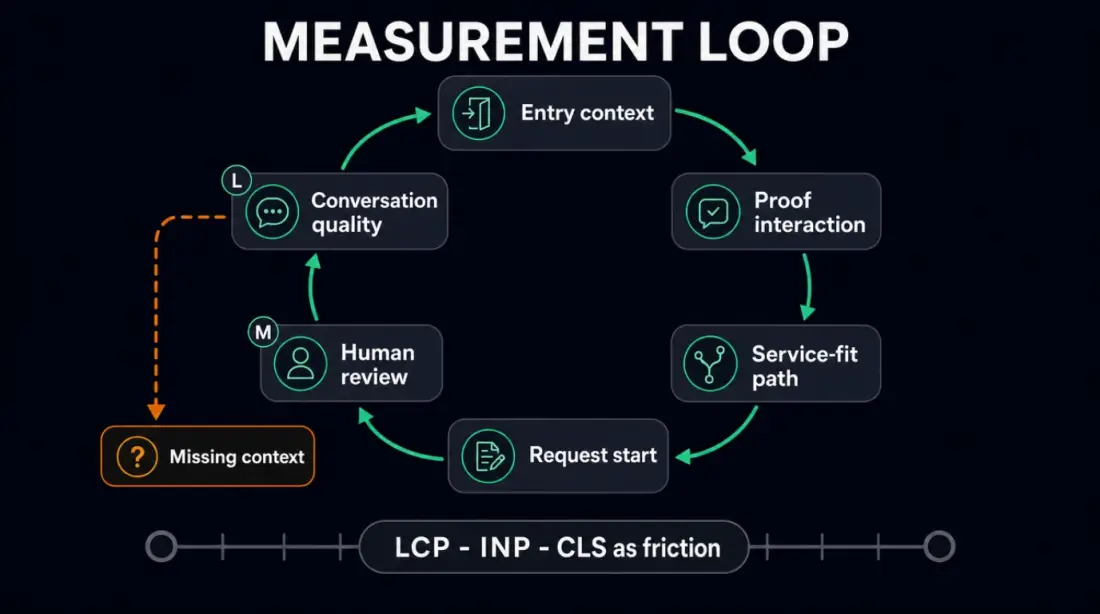
Practical signals include entry page, referrer or UTM data, selected service-fit path, proof interaction, request start, abandonment point, missing context in the request, response time, responsible person, and first-conversation outcome. None of these metrics proves that AI search caused the lead. Together, they show whether the page creates better conversations or merely collects forms.
Performance belongs in that measurement set. Google describes Core Web Vitals as signals for loading, interactivity, and visual stability, including LCP, INP, and CLS as central metrics (web.dev Web Vitals). A slow or unstable page creates friction before proof is even visible. That does not create a ranking or conversion guarantee. It supports a plain operating point: a page that is supposed to reduce decision friction should not become a technical hurdle itself.
For der DACH-weit agierende technische Dienstleister, a useful monthly report would not be "traffic down 18 percent, forms up 2." A more useful report would be: "The modernization page had 36 CTA interactions, 14 form starts, 9 qualified conversations, equipment age was missing in 5 cases, the downtime proof block was mentioned in 3 cases, and 2 inquiries required manual no-fit review." That is less glamorous, but it can be managed.
A realistic SME workflow
Before the rebuild, der DACH-weit agierende technische Dienstleister has a generic landing page. Marie owns the copy, Lukas answers inbound questions, Nina checks operational feasibility, and Jonas handles the website. The page has a broad service description, a general contact form, and a separate references section. Incoming requests land in an inbox and are distributed manually.
After the rebuild, the page stays intentionally narrow. It addresses existing equipment that needs modernization, shows a clear promise above the fold, explains three common starting situations, and places a proof block from a comparable project next to the CTA. Instead of "contact us," there are three paths: callback for urgent cases, fit check for modernization, and general question.
The form asks only what the first step needs: name, business email, company or equipment context, service interest, short problem summary, and the required privacy acceptance. Budget questions, exact scheduling, spare part numbers, and detailed technical diagnosis move into human follow-up. That keeps the barrier lower without making the team blind.
The review gates are explicitly human. Marie and Lukas approve the promise, proof block, and form fields before launch. Automated confirmations may acknowledge receipt and explain the expected next step, but they do not make diagnostic, pricing, or delivery commitments. Lukas reviews high-value, urgent, or ambiguous inquiries before a calendar slot or commercial statement is sent. Nina joins only when the request has been classified operationally.
Each week, Marie and Lukas review ten qualified conversations. Which source brought the context? Which proof was mentioned? Which field was missing? Where was intent unclear? Which automated response had to be corrected by a person? That review is the real learning loop. The landing page improves through visible decision friction, not through guesswork.
The boundary to the lead system matters. This landing page decides whether a visitor trusts the next step enough to act. The deeper lead-intake model, owner assignment, and reminder logic belong downstream. This article stays before the form and at the handoff boundary.
How Planfold embeds landing pages in the Digital Headquarters
Planfold treats a landing page as an operated part of the Digital Headquarters, not as a standalone campaign page. The page explains the offer, makes proof visible, captures only necessary context, and hands the request into a traceable process. This is not a traffic trick. It is an operating architecture for trust and next steps.
Plan means auditing search and AI entry context, current claims, proof placement, service fit, form fields, consent copy, performance, and follow-up data. The output is not abstract strategy. It is a map of where buyer questions remain unanswered or trust is lost.
Unfold means building the page architecture. That includes server-rendered content, clear entities, fast load behavior, structured proof blocks, short forms, server-side validation, source metadata, and a backend-first handoff. Where useful, n8n can then support acknowledgement, internal notification, status visibility, retry, and error paths.
Resonate means reviewing decision quality. Not just whether a form fired, but whether the conversation was qualified, which context was missing, who responded, whether follow-up stayed visible, and which proof elements helped create trust.
n8n belongs at the handoff boundary. The n8n documentation shows that workflow executions can be visible, filterable, and recoverable when errors occur (n8n Executions and Error Handling). That is useful for acknowledgement, routing, owner assignment, and error alerts. It does not replace domain review, consent decisions, or commercial approval.
The 30-day start: one page, one decision, one review
You do not need to rebuild every page to test the model. A useful start is a 30-day sprint around one high-intent landing page. The constraint is intentional: a one-page test shows faster whether your architecture answers buyer and trust questions.
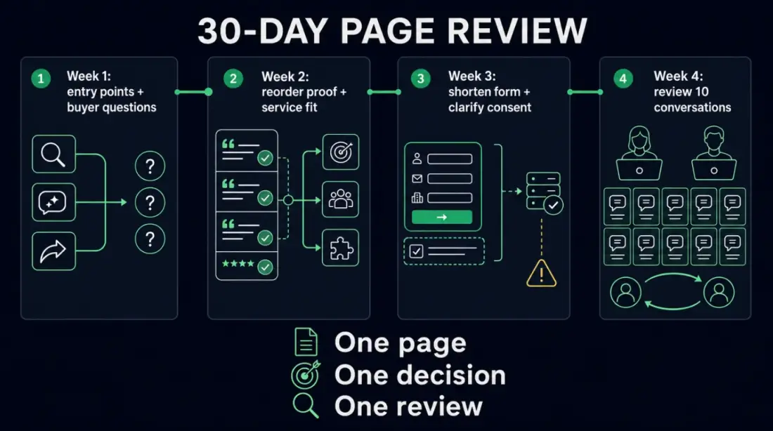
Week 1: collect entry points and buyer questions. Review search queries, AI-snippet context, referrers, existing sales conversations, and recurring objections. Marie collects questions from forms and calls; Lukas marks which questions should be answered before the CTA.
Week 2: reorder proof and service fit. Place the strongest evidence beside the next step. Separate two or three intents: callback, fit check, general question. Anything that does not support the decision moves lower on the page or into a separate proof page.
Week 3: shorten the form and clarify consent. Remove fields that are only needed during the conversation. Explain visibly how the information will be used and what happens next. Check server-side validation, source metadata, and privacy acceptance.
Week 4: review conversation quality. Do not evaluate form counts alone. Review ten conversations: was the context sufficient, was the next step clear, did proof need to be resent, were there no-fit cases, and did a responsible person own the request?
If your most important landing page currently explains the offer broadly and ends with a form, the next step is not another campaign budget. The next step is a Presence review: which decision must this page earn, which proof belongs next to it, which data is needed for the first step, and how does follow-up stay visible?
Plan. Unfold. Stay Sovereign.